Today we launch the redesigned user interface of Ulabase. The redesign changes the look of the console and also the way you move through your backend services.
The interface moved from Angular Material to Spartan UI, and the navigation was reorganized.
Why We Rebuilt the UI
The old interface worked, and developers told us where it fell short. They wanted faster navigation between organizations and services. They wanted a clearer visual hierarchy. They wanted an interface aligned with current design standards.
We redesigned the whole interface with those requests in mind.
The Technology: Spartan UI
We migrated from Angular Material to Spartan UI, a component library that brings shadcn/ui's design philosophy to Angular applications.
Why Spartan UI? It provides accessible, customizable components. The components are lightweight and designed with developer experience in mind. Spartan UI also lets us build the interface our users need without working against opinionated framework decisions.
The migration went further than swapping components. We reviewed every interaction, every layout and every visual element, so that the interface is consistent from screen to screen.
Patterns Users Already Know
Web applications share patterns that users already understand. We applied these patterns throughout the new UI.
Persistent Sidenav Navigation
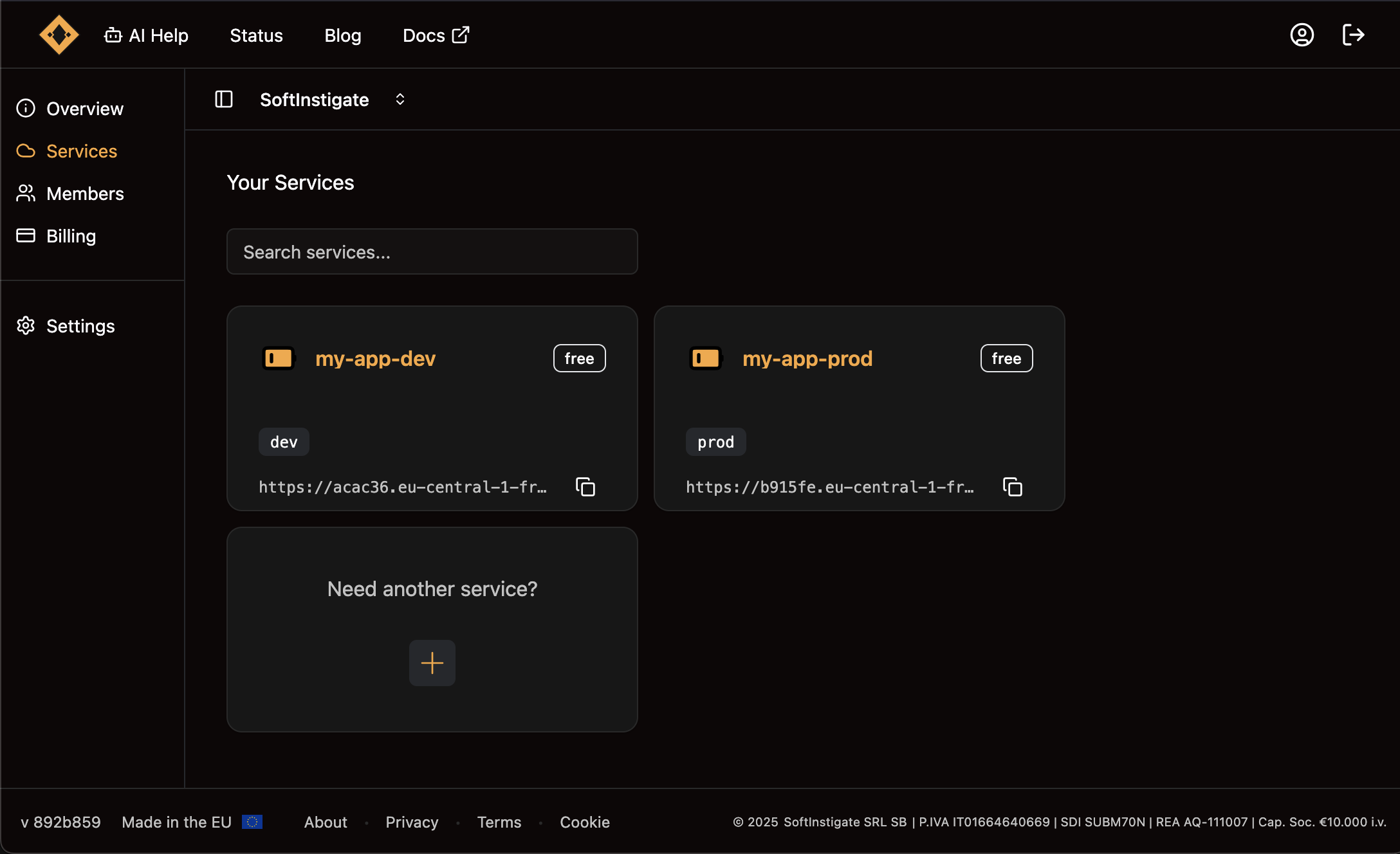
The most significant change is the new persistent sidenav. Organizations and services are always visible in the left sidebar.
Your organizations are listed there, and your services are one click away. You always see which organization and which service you are working on.
The sidenav collapses on smaller screens and gives quick access to every section. Switching organization and selecting a service take one click each, so you spend less time navigating.
Clear Visual Hierarchy
Every screen follows the same design patterns. Primary actions are prominent. Secondary options are reachable without cluttering the interface. Each screen shows what you need without crowding it.
Cards, spacing, typography, and color work together to guide your attention. Important information stands out, and related actions are grouped.
Consistent Component Patterns
Similar actions use similar components across the entire application. Form patterns are consistent. Button hierarchies are predictable. Feedback messages appear in expected locations.
With this consistency you learn the interface once and apply that knowledge on every screen.
What's New in the Interface
Modern Service Cards
Service cards now show the essential information at a glance. Status indicators are color-coded. Quick actions are available directly on the card. Resource usage and metrics are visible without opening the details.
Streamlined Service Creation
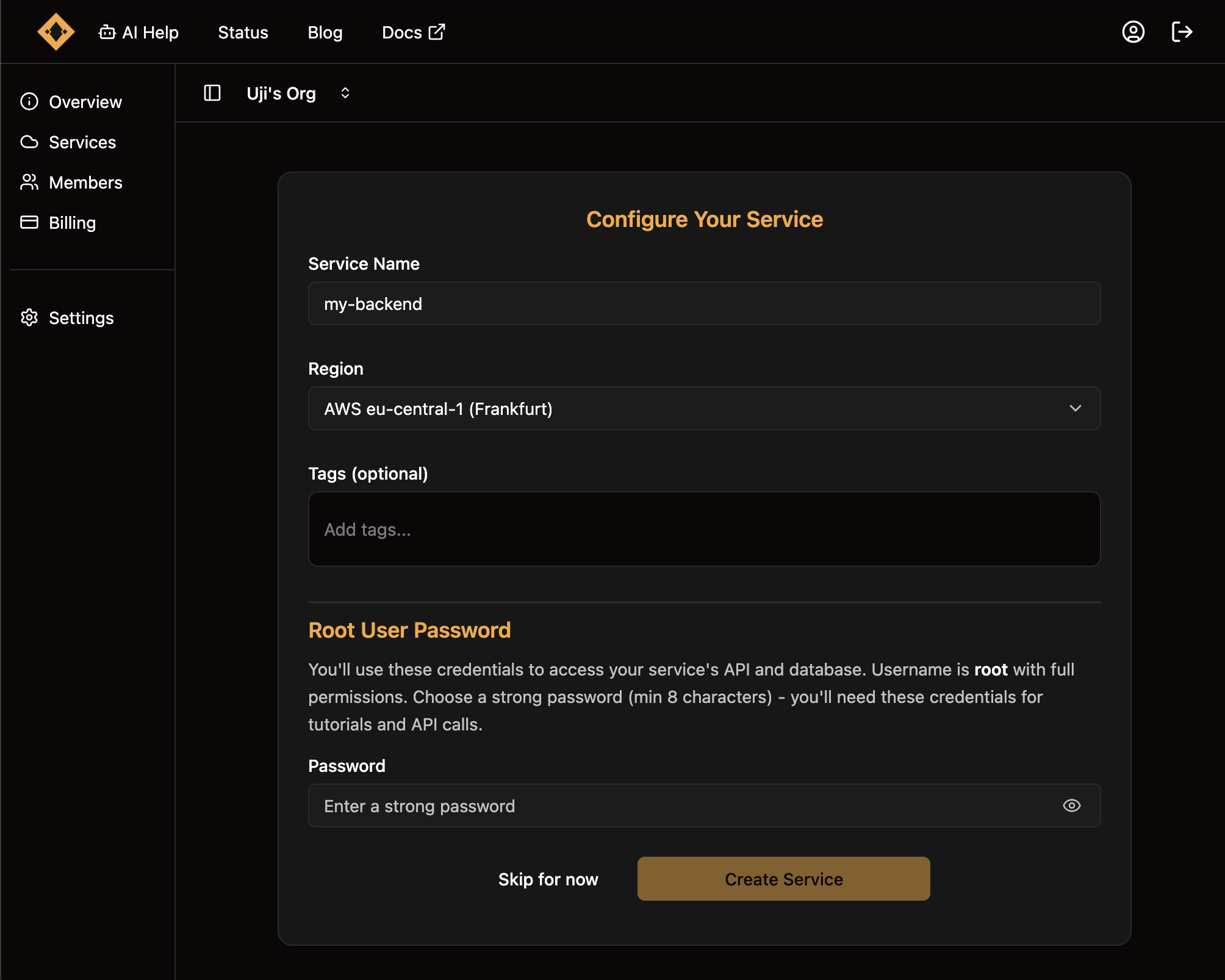
Creating a new service is faster and clearer. The wizard guides you through each step with contextual help. Configuration options are grouped logically. You can review everything before provisioning.
Enhanced Plugin Management
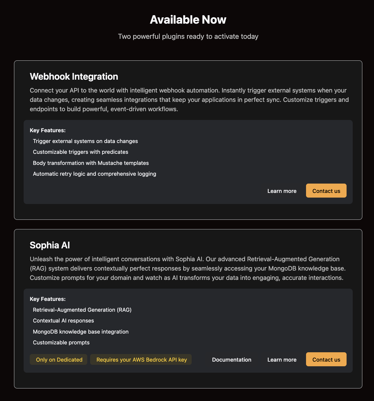
Plugin configuration is easier to follow. Available plugins are listed with descriptions and pricing. When you enable a plugin you see what you get and what it costs.
Improved Status Monitoring
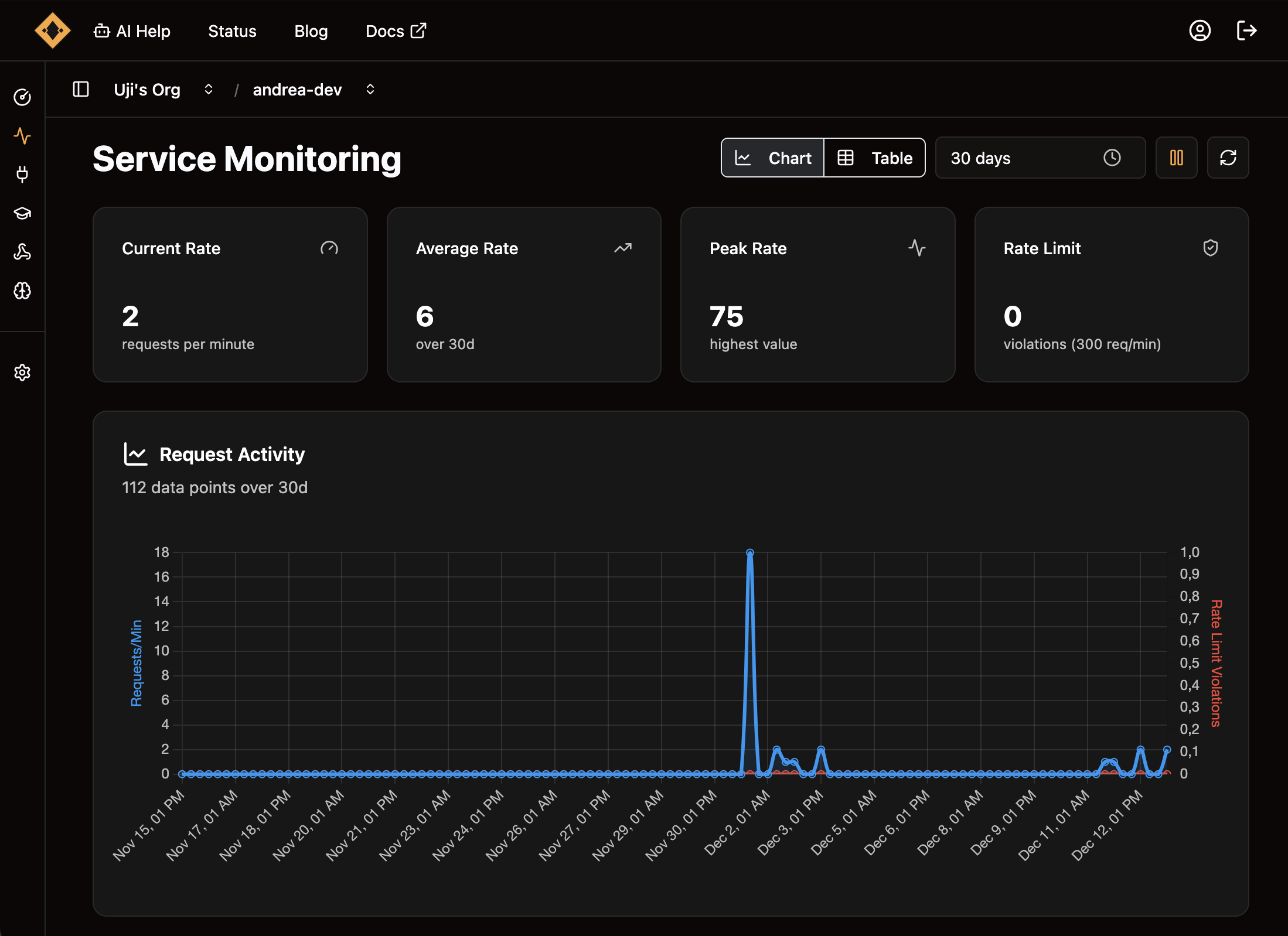
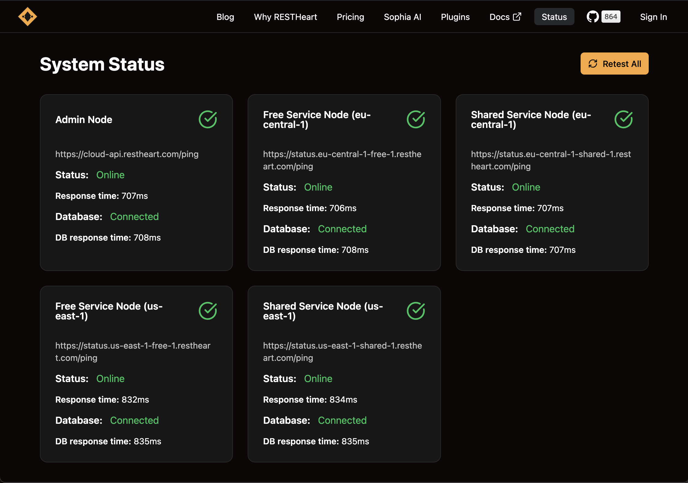
The status page shows the health of the Ulabase nodes, checked when you open it. Each node shows whether it is online, whether its database is connected, and how fast the database answers. A node with a problem is shown in red.
Better Webhook Configuration
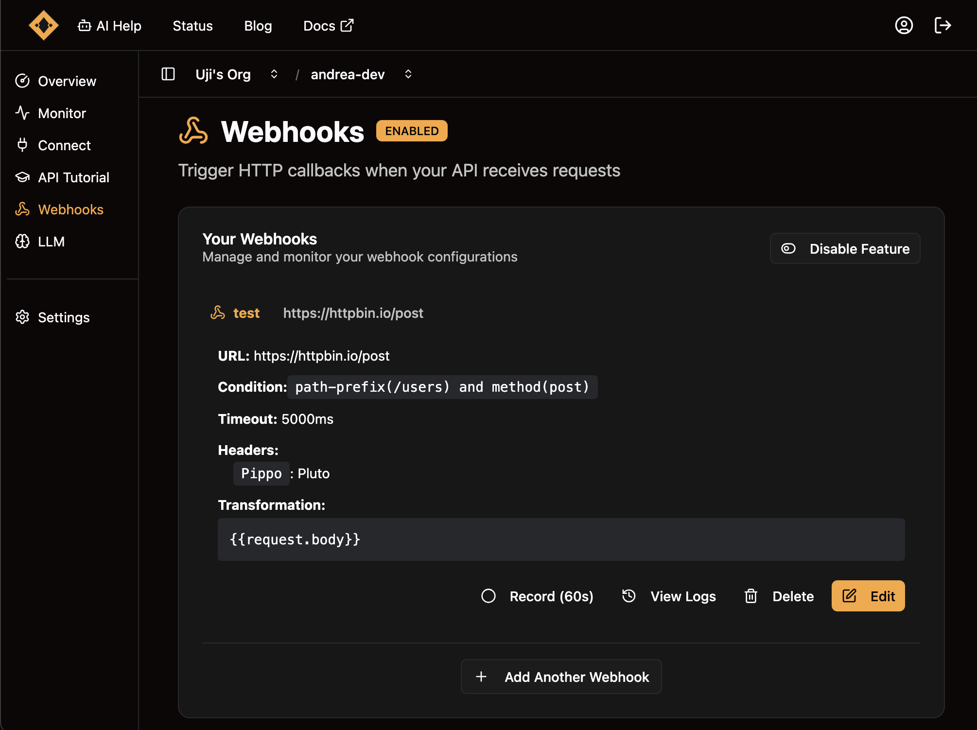
Webhook plugin setup is now visual. You configure triggers in a form and test webhooks directly from the UI. You can record live traffic for 60 seconds and read the log of each delivery.
The UX Philosophy
Our design rests on three principles: clarity, efficiency, and delight.
Clarity
Every element has a purpose. Labels are descriptive. Actions are easy to find. The interface can be used without reading documentation.
Related concepts are grouped together, and the navigation paths follow that grouping. You always know where you are and how to reach another section.
Efficiency
Common tasks take fewer clicks. Keyboard shortcuts work where you expect them. The interface shows the actions relevant to what you are doing.
You spend less time clicking through menus and more time on your work.
Delight
The interface is polished. Animations are smooth and have a purpose. Interactions give feedback. The small details make the experience enjoyable.
We worked on those details so that using the interface feels good.
Responsive by Default
The new interface works on all screen sizes. Desktop users get an information-dense layout. Tablet users get a layout that uses the available space. Mobile users get a reduced interface that puts the essential functions first.
Responsive behavior is built into every component and layout from the start.
Accessibility First
The new interface follows the WCAG guidelines for keyboard navigation, screen reader support, color contrast, and focus management.
Everyone should be able to use Ulabase effectively, and we treat accessibility as a feature of the product.
Performance Improvements
The migration to Spartan UI also made the interface lighter. Components load faster, and interactions respond sooner.
What Stayed the Same
We redesigned the interface and left the platform as it was. All your services work exactly as before. The APIs did not change. Configurations are preserved. Your applications keep running without any modification.
This is a UI update: the backend is the same.
Developer Feedback Shaped This
This redesign came from listening to developers who use Ulabase every day. You told us what worked and what didn't. You shared the workflows that were frustrating and the features you wished existed.
Every design decision was informed by real usage patterns and by that feedback.
Start Using the New UI Today
The new interface is live for all Ulabase users, with no migration and no opt-in. Log in and you see the redesigned interface.
If you have feedback or suggestions, tell us. We will keep improving the interface, and your input decides what comes next.
What's Next
This redesign is the base for features we are working on: enhanced analytics dashboards, more monitoring tools, and deeper customization options.
Thank You
To everyone who provided feedback, tested early versions, and shared their workflows: thank you. The redesign is better for your input.
Ulabase exists to make developers more productive, and this redesign is a step toward that goal.
Build your app on Ulabase
Your backend is ready in minutes, and you spend your time on your app. The Free plan needs no credit card.